
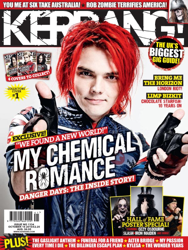
The uses and gratifications of this magazine is personal and entertainment, the cover links to the style of the demographic and fans within the genre of rock. Kerrang is a well-known rock magazine across the United Kingdom, strictly only featuring artists/bands from the genre of rock. Featuring artists/bands such as; Bring Me The Horizon, Don Broco, Muse ETC… and in this case Gerard Way from My Chemical Romance. Gerard Way; the cover model is represented in some ideologies of a rock/punk star such as the roughly styled, dyed red hair. Some may argue that red is a rather expressive colour this suggests that the dyed red hair connotes rather well with rock which is usually known as a rather expressive genre. On the other hand, Gerard seems to be wearing a racer jacket and leather gloves, yes the leather gloves may follow the ideology of a rock star whilst the racer jacket does not. A possibility to why this has been done; is to celebrate another aspect of ‘rock’; individuality. Individuality is a crucial factor within the music industry, especially rock. The cover may suggest that Gerard is just expressing his own style. This appeals to the demographic because the audience o0f modern rock is typically seen as individuals whom express themselves through things as dyed hair. Gerard is looking directly at the camera, this creates a sense of direct address towards the target market, and his facial expression is rather ‘laid back’ some may say that this is unusually for a genre that is known to be more sinister in a sense but another aspect of rock is rather care free. Do his ‘laid back’ facial expression relates to the care free or ‘I don’t care’ attitude that the genre of rock contains.
The masthead follows the same house style Kerrang always use, like any other magazine. From time to time, Kerrang change the colour of the masthead depending on the background. In this case, the colour is white upon black; the use of a black and white contrast here makes the masthead stand out/eye catching The masthead appears to be broken like shattered glass this links to the sterotype/idea that rock is an aggressive/expressive genre.. The mast head is behind Gerard, this follows the same codes and conventions of other big magazines; since Kerrang is a well-known magazine with a rather large following they don’t need to make the masthead apparent for their audience to know that it is Kerrang. The colour scheme used throughout the cover is read, white, black and yellow. This has been done because these colours are very contrasting, clashing together; again this use of the colour scheme makes the cover as a whole stand out, whilst highlighting text so the demographics eye’s would be instantly drawn to the main stories. The use of the colour red may suggest anchorage between the highlighted text and Gerard’s hair; this neatens up the overall aesthetic appeal of the front cover.
The name of the band (My Chemical Romance) is dominate across this cover, allowing the demographic to know what band this month’s issue is all about, the text also contains anchorage; within the ‘O’ there appears to be a black widow, this symbolises death a rather dark topic which can be associated with rock. The anchorage of the black widow relates to the band, they’re called ‘My Chemical Romance’, the black widow is poisoners which relates to ‘chemical’ such as chemical reactions. The black widow is also known for devouring their mate which is associated with a rather abstract idea of romance, giving the idea that ‘My Chemical Romance’ is a deadly one. This also links into Richards Dyer’s ‘star’ theory; the use of big acts such as My Chemical Romance is more likely to raise attention and sales of this issue rather than using a small, not well-known act. The pull quote on the top “we found a new world” and the text above naming this “EXCLUSIVE” creates the sense of importance surrounding the pull quote this in itself creates more attraction to the article. The idea is that fans will wonder why this article is exclusive and will want to read on into the magazine to find out. The cover line below “danger days: the inside story” again creates an atmosphere of importance, the word “danger” has adventurous connotations towards it. “The inside story” emits an aura of secrecy, subconsciously manipulating the audience, tempting them to find out ‘the inside story’. Whilst finishing off with an explanation mark, adding to this importance.
Sell lines along the right hand side of the cover features other bands of interest; Bring Me The Horizon and Limp Bizkit again this applies to the ‘Star’ theory, using other big acts attracts a wider audience whom are interested in them, in some cases certain factions of the demographic maybe more interested in the sell line acts rather than the main. This creates a wider appeal thus raising issue sales.
The over uses secondary images, this gives the audience an indication of what to expect/find in this magazine. In this case, below the secondary images is text saying “hall of fame poster special”, including freebies will furthermore attract the audience. Using secondary images to inform the demographic to what posters they’ll find inside, fans within the demographic will see that there is a poster of their favourite artist e.g. Ozzy Osbourne, yes they’ll pick up the magazine for the articles but also for the posters inside. The other use of secondary images informs the target market that this cover is one of four collective’s covers. This creates the sense that this cover is special compared to others, this will attract members of the target market to buy and keep this “collectors cover”.
There are flash buttons, one containing the text “the UK’s biggest gig guide”, this will in turn attract gig lovers creating the idea that you should purchase this magazine, if you want to know everything you need to know about gigs hence the statement “UK’s biggest gig guide”. The second flash button is long the strapline; “PLUS” is loud and proud informing the audience that there is even more within this magazine and this is detailed along the strapline so you know exactly what is contained within. Lastly the banner, this again gives even more details of what you can expect inside, using well known bands which will further attract their fans within the demographic.
All together this cover follows the same codes and conventions as other magazines as well as using ideologies to connect with their demographic and the genre of music. Every technique used has been designed to create the most attention and interest that it could possible do within it’s demographic.
